-
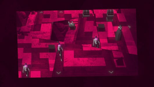
Coming this May, it's is right old brain teaser - and the closest we'll ever get to Device 6 on PC
-

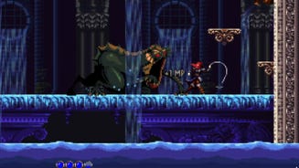
Still Wakes The Deep’s authentic horror aims to channel Ken Loach by way of Stanley Kubrick
“In obscurity comes horror,” says lead designer Rob McLachlan
-

SteamWorld Heist 2 revealed, bringing a ragtag crew of seafaring robots to PC this August
Simultaneously announced and revealed at the Nintendo Indie World Showcase
-

How Rockstar banning Cake Day helped launch a designer's career in edible games
Former L.A. Noire developer Jenn Sandercock on the overlap between feast and play
-

GTA 6 publishers Take-Two cancel games and lay off hundreds to "rationalize" their pipeline
Five percent of workforce to be let go
-
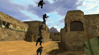
What's better: a 'put back' action, or standing atop another player's head in an FPS?
Vote now as we continue deciding the single best thing in games
-
You can sign up to play Hades 2 early right now
Supergiant announce technical demo including the game's first major area
-
Still plenty of ways to make children miserable, though
-
Manor Lords performs fine on Steam Deck – it’s the controls you’ll want to watch out for
Contort your thumbs now, my lord
-
Katharine is leaving RPS, come say goodbye
And thank you for all the words
-
The Maw - 15th-20th April 2024
This week's least boring videogame releases, plus our weekly liveblog
Live
Psst! Explore our new "For you" section and get personalised recommendations about what to read.
-

£25 for a pair of speakers sounds great to us
These Creative Pebble V3 speakers are a great choice for rich, clear audio on a budget.
-

Get the fastest PCIe 4.0 SSD for $139 at Amazon
Save over $50 on the Crucial T500.
-

You can get a WD Black SN850X 2TB SSD for as little as £112 but they're selling fast
Save up to £28 on this speedy SSD using the eBay app and a special discount code.
-

The Crucial P3 2TB, one of the fastest 3.0 SSDs, is on sale for just £85
Get a big chunk of storage space for a bargain price.
-

How you sign in to this site is changing slightly
ReedPop ID is now Gamer Network ID.
-

I've only played three out of the 34 games so far!
-

Morels 2 sure has a lot of unicorns, for a mushroom collection game
Shitake a look at this
-
Shadow-hopping platformer Schim emerges into the light in July
A bit like Hitman but a platformer and with no murder?
-

Homeworld 3 DLC plans revealed alongside collector’s edition with model spaceships
Expect a mix of free and paid updates aimed at its ‘War Games’ multiplayer mode
-

No Rest For The Wicked will be playable on Steam Deck, although recommended PC specs may be a worry
Should be good couch fodder
-
I am once again reminding you that hype is short for hyperbole
-
Bethesda's Todd Howard clarifies the fate of Shady Sands in the Fallout TV show timeline
Obsidian's New Vegas very much still part of Fallout history
-
SteamWorld Heist 2 revealed, bringing a ragtag crew of seafaring robots to PC this August
Simultaneously announced and revealed at the Nintendo Indie World Showcase
-
Supporters only: An action platformer about getting an eye back from ants affirms my belief that games need a Ronseal approach to their titles
Ants Took My Eyeball is about a man who has had his eyeball taken. By ants.
I sometimes struggle with what to write about for supporter posts (a contender this week was "why does Fallout the TV show insist Walton Goggins' character is from California when he talks like Foghorn Leghorn?"). And then we got an email about a game called Ants Took My Eyeball and I was like "Man, games need good names more often." I played the Steam demo …
-
Supporters only: Carpathian Night Starring Bela Lugosi takes Castlevania back to basics
And they call it Bela Notmuche
-
Supporters only: Fantasy games have a weird relationship with regional British accents
Whose epaulet is that pauldron?
-
Supporters only: I am obsessed with this detailed but very weird aquarium sim
Right click to throw away
Get your first month for £1 (normally £3.99) when you buy a Standard Rock Paper Shotgun subscription. Enjoy ad-free browsing, our monthly letter from the editor, and discounts on RPS merch. Your support helps us create more great writing about PC games.
See more information-

Review: Goblin Stone review: turn-based charm spells only last so long
Goblin’ up my patience more like
-
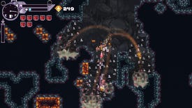
Review: Bore Blasters review: achieve catharsis as a dwarf yelling and shooting mud
Explodey hole
-
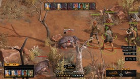
Review: Broken Roads review: this Fallout-style RPG is Vegemite and (some) magic
Dollarydoo or dollarydon’t?
-

Review: Children Of The Sun review: an intense and stylish puzzle of ultraviolence
The only option is shoot to kill
-

A very puzzling collection
-

The 15 best open world games on PC
Keep your options open
-

Review: Botany Manor review: peaceful and beautiful best-in-show plant puzzles
Come away, O human child! To the waters and the wild
-

From older classics to brand new trail-blazers
-

After six months of renovations, Cities: Skylines 2 performance is considerably less terrible
Some GPUs get more than double the frames since launch
-

Manor Lords performs fine on Steam Deck – it’s the controls you’ll want to watch out for
Contort your thumbs now, my lord
-

Manor Lords’ early access launch is built on solid technical ground, mostly
Mind your manors with this performance and settings guide
-

How to connect a Steam Deck to a TV
It's not quite plug and play
-

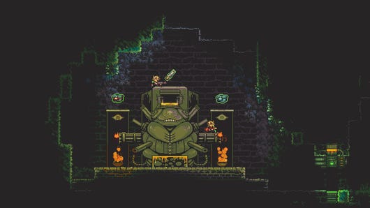
FACEMINER is the dystopian surveillance work-from-home side hustle you’ve always wanted
the world's first 'hardcore thriller clicker'-type game
-
Still Wakes The Deep’s authentic horror aims to channel Ken Loach by way of Stanley Kubrick
“In obscurity comes horror,” says lead designer Rob McLachlan
-

Pool Of Madness is pool by way of Lovecraft
I can only imagine someone said ‘Cue-thulhu’ by mistake and took it from there
-

Screenshot Saturday Mondays: Flintlocks and chainsaw bayonets
I go on Twitter so you don't have to
-
How you sign in to this site is changing slightly
ReedPop ID is now Gamer Network ID.
-

The Electronic Wireless Show podcast S3 Episode 15: everyone loves Fallout and the Fallout TV show
We give it seven Vault Boy thumbs up
-

I spoke to an Nvidia AI NPC, and he mainly wanted to get me bladdered
In conversation with the cocktail-obsessed gamepeople of our supposed future
-
I've only played three out of the 34 games so far!
-
Morels 2 sure has a lot of unicorns, for a mushroom collection game
Shitake a look at this
-
Shadow-hopping platformer Schim emerges into the light in July
A bit like Hitman but a platformer and with no murder?
-
1000xResist is a time travel story inspired by Star Trek, the pandemic and immigrant trauma
And also, a work of experimental theatre
-
Homeworld 3 DLC plans revealed alongside collector’s edition with model spaceships
Expect a mix of free and paid updates aimed at its ‘War Games’ multiplayer mode
-
No Rest For The Wicked will be playable on Steam Deck, although recommended PC specs may be a worry
Should be good couch fodder
-
I am once again reminding you that hype is short for hyperbole
-

This week's GTA Online Podium Car
Find out which car is the podium prize this week
-

Honkai Star Rail codes (April 2024)
Gain Stellar Jade and more rewards with these Honkai: Star Rail codes before they expire!
-

A full walkthrough of every main quest in Dragon's Dogma 2
-

Dragon's Dogma 2: When Wills Collide quest walkthrough
The time has come to finally complete Dragon's Dogma 2, in When Wills Collide
-

Dragon's Dogma 2: A Scholarly Pursuit quest walkthrough
Here's how to kill off a draconic jar in A Scholarly Pursuit
-

Dragon's Dogma 2: Halls of the First Dawn quest walkthrough
Evacuating cities and killing Purgener Dragons awaits in Halls of the First Dawn
-
Dragon's Dogma 2: All Sphinx riddle solutions
Here are all ten Sphinx riddle solutions in Dragon's Dogma 2
-
Here's an archive of previous Wordle words
-
Today's NYT Connections hint and answers (Thu, Apr 18)
Need a hint for today's Connections? Read our guide for help with Connections #312
-
Wordle hint and answer today #1034 (April 18 2024)
Stuck on today's Wordle word for April 18? Read our hint or find the answer below!

Deputy Editor

Associate Editor

News Editor

Reviews Editor

Hardware Editor

Guides Editor

Guides Writer

Guides Writer

Staff Writer
7