-
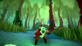
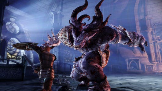
Review: Another Crab's Treasure review: a playful Soulslike for everyone, especially if you like crabs
This will more than tide you over
-

Review: Sand Land review: a boring Mad Max lite that should have been very exciting
More like Bland Land, am I right?
-

Latest Horizon Forbidden West PC patch finally fixes its weirdest issue
Nvidia Reflex, you’ve bested me for the last time
-

The original Fallout is the perfect antidote to Fallout fever
War did change, actually
-
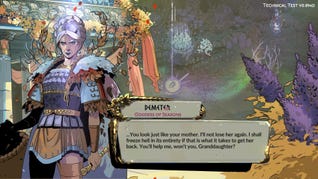
The kissable frogs and sparky combat of Hades 2 looks set to bewitch fans
Impressions of the "technical test"
-

Whatever the Fallout TV show does with New Vegas lore, Josh Sawyer doesn’t care: “It was never mine”
The Obsidian design director on Pillars of Eternity II burnout and living with dead projects
-
Lethal Company gets worse as you get better
Why being dumb is good, actually
-
The Maw - 22nd-27th April 2024
This week's least outwardly offputting game releases, plus our weekly newsblog
Live -
Should You Bother With... Hall effect keyboards?
Heroes of might and magnets
Psst! Explore our new "For you" section and get personalised recommendations about what to read.
-

£25 for a pair of speakers sounds great to us
These Creative Pebble V3 speakers are a great choice for rich, clear audio on a budget.
-

Get the fastest PCIe 4.0 SSD for $139 at Amazon
Save over $50 on the Crucial T500.
-

You can get a WD Black SN850X 2TB SSD for as little as £112 but they're selling fast
Save up to £28 on this speedy SSD using the eBay app and a special discount code.
-

The Crucial P3 2TB, one of the fastest 3.0 SSDs, is on sale for just £85
Get a big chunk of storage space for a bargain price.
-

Erangel Classic returns for two weeks next month
-
Former Fable devs reveal a new co-op RPG, then announce its development is on hold amid layoffs
Flaming Fowl will shift to a smaller game they can fund themselves
-

The ‘Agent Trevor’ pack would’ve accompanied zombie and alien-themed expansions
-

Head of Ori and the Blind Forest studio says there’s “just no way” they could’ve shipped the game without player feedback
-

Minecraft rolls out armadillo mob and rewilds biomes with eight new wolf variants
Chewier on the inside
-

Lords Of The Fallen's latest update adds cruel modifiers that turn it into a roguelike
One for the masochists
-
The Don't Starve devs' new cutesy co-cop dungeon crawler is out in early access today
Rotwood allows you and up to three friends to kill a tree
-
You can now pre-register for Genshin developer's Zenless Zone Zero
It's due sometime in the first half of 2024
-
Supporters only: Watching Civil War made me want more games with black and white stances on morality
I can't think of any good modern examples!
I went to see Civil War this weekend. I liked a bunch of it, didn't like a bunch of it. One thing I thought was very obvious is that it sanitises its titular conflict of any political context. On the one hand, I understand this as part of the theming, said almost directly into the camera by Kirsten Dunst's photojournalist character: as journalists they're there …
-

Supporters only: Piecing It Together gave me a timely little island of calm
Good thing I got my pieces
-
Supporters only: What are ‘solvable’ games, and is being solvable a bad thing?
Balatroptimisation
-
Supporters only: An action platformer about getting an eye back from ants affirms my belief that games need a Ronseal approach to their titles
Ants Took My Eyeball is about a man who has had his eyeball taken. By ants.
Get your first month for £1 (normally £3.99) when you buy a Standard Rock Paper Shotgun subscription. Enjoy ad-free browsing, our monthly letter from the editor, and discounts on RPS merch. Your support helps us create more great writing about PC games.
See more information-
Review: Another Crab's Treasure review: a playful Soulslike for everyone, especially if you like crabs
This will more than tide you over
-
Review: Sand Land review: a boring Mad Max lite that should have been very exciting
More like Bland Land, am I right?
-

Review: Tales Of Kenzera: Zau review: a beautifully designed yet imprecise platforming adventure
It's not time to make a change

-

The best farming games like Stardew Valley on PC
The cream of the crop
-

A very puzzling collection
-

The 15 best open world games on PC
Keep your options open
-

Review: Botany Manor review: peaceful and beautiful best-in-show plant puzzles
Come away, O human child! To the waters and the wild
-

Should You Bother With... Hall effect keyboards?
Heroes of might and magnets
-

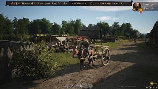
Arise now, ye Cerim: No Rest for the Wicked’s performance updates are underway
Already running better on low-end GPUs
-

No Rest for the Wicked’s PC performance suggests the wicked might be better off waiting
Got them early access growing pains
-

After six months of renovations, Cities: Skylines 2 performance is considerably less terrible
Some GPUs get more than double the frames since launch
-
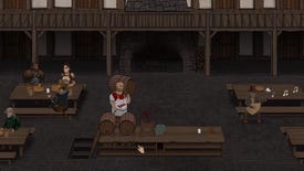
Innkeep satisfies my craving for a fantasy game that's just a grim drudgery simulator
Something need doing?
-

Hellish indie horror IRIS can get in the toaster and I’m sure the feeling is mutual
Actively hostile to my attempts to not put it straight in the toaster
-

Cereballers is a free 2D football parody with a spark of real genius
The offside rule is the least of your problems
-
Erangel Classic returns for two weeks next month
-
Former Fable devs reveal a new co-op RPG, then announce its development is on hold amid layoffs
Flaming Fowl will shift to a smaller game they can fund themselves
-
The ‘Agent Trevor’ pack would’ve accompanied zombie and alien-themed expansions
-
Head of Ori and the Blind Forest studio says there’s “just no way” they could’ve shipped the game without player feedback
-
Should You Bother With... Hall effect keyboards?
Heroes of might and magnets
-
Review: Another Crab's Treasure review: a playful Soulslike for everyone, especially if you like crabs
This will more than tide you over
-
Review: Sand Land review: a boring Mad Max lite that should have been very exciting
More like Bland Land, am I right?
-
Supporters only: Watching Civil War made me want more games with black and white stances on morality
I can't think of any good modern examples!
-
Minecraft rolls out armadillo mob and rewilds biomes with eight new wolf variants
Chewier on the inside
-

Here's an archive of previous Wordle words
-

Today's NYT Connections hint and answers (Thu, Apr 25)
Need a hint for today's Connections? Read our guide for help with Connections #319
-

Wordle hint and answer today #1041 (April 25 2024)
Stuck on today's Wordle word for April 25? Read our hint or find the answer below!
-

Genshin Impact codes [April 2024]
All the currently active Genshin Impact codes on offer
-
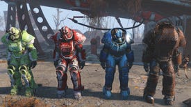
Fallout 4: Best Power Armor and where to find
Here are the best Power Armor sets in Fallout 4 and where to find them
-
NYT Connections hint and answers (Wed, Apr 24)
Need a hint for Connections? Read our guide for help with Connections #318
-
Wordle hint and answer #1040 (April 24 2024)
Stuck on today's the word for April 24? Read our hint or find the answer below!
-
NYT Connections hint and answers (Tue, Apr 23)
Need a hint for today's Connections? Read our guide for help with Connections #317
-
Wordle hint and answer #1039 (April 23 2024)
Stuck on today's Wordle word for April 23? Read our hint or find the answer below!
-
Whether cop or robber, you'll benefit from the freebies these codes get you

Deputy Editor

Former Associate Editor

News Editor

Reviews Editor

Hardware Editor

Guides Editor

Guides Writer

Guides Writer

Staff Writer